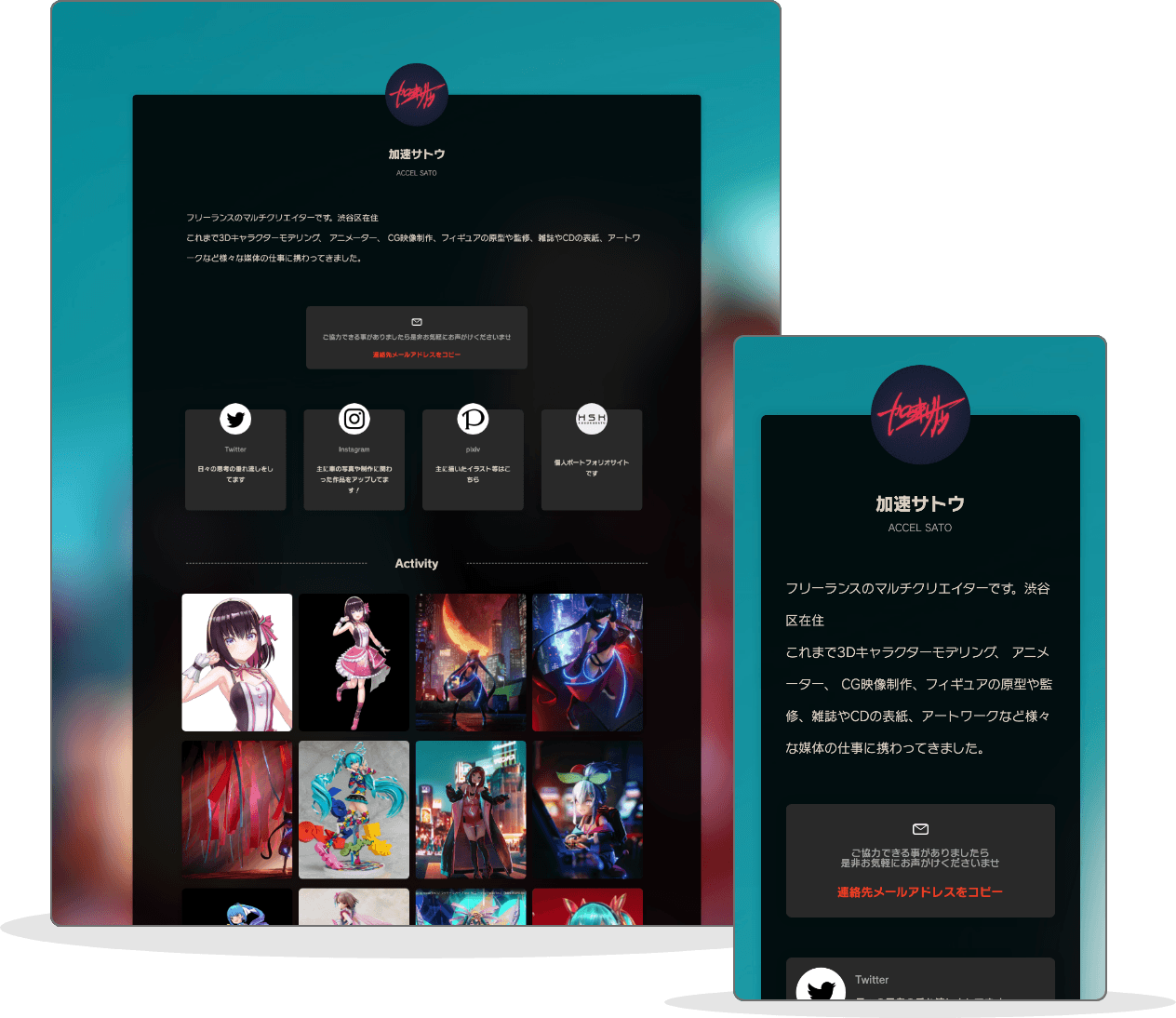
“POTOFU TRY!!” is where creators from various fields try out POTOFU and ask for custom points. This time, Kasoku Sato, who is active in multiple fields, such as character modeling and animation, and recently in charge of visuals for virtual singer AzKi. You have commented on a cool public profile page that uses dark mode effectively.
Vol.2
What if multi creator Kasoku Sato
makes POTOFU

<This is the point!>
I wanted to create a feeling that there was light in the dark, so I chose a picture with such a direction from my own work and used a blurred image for the background image. The idea was that by blurring the background, the main content portion in the center would stand out more.

Background image that makes use of blurred light
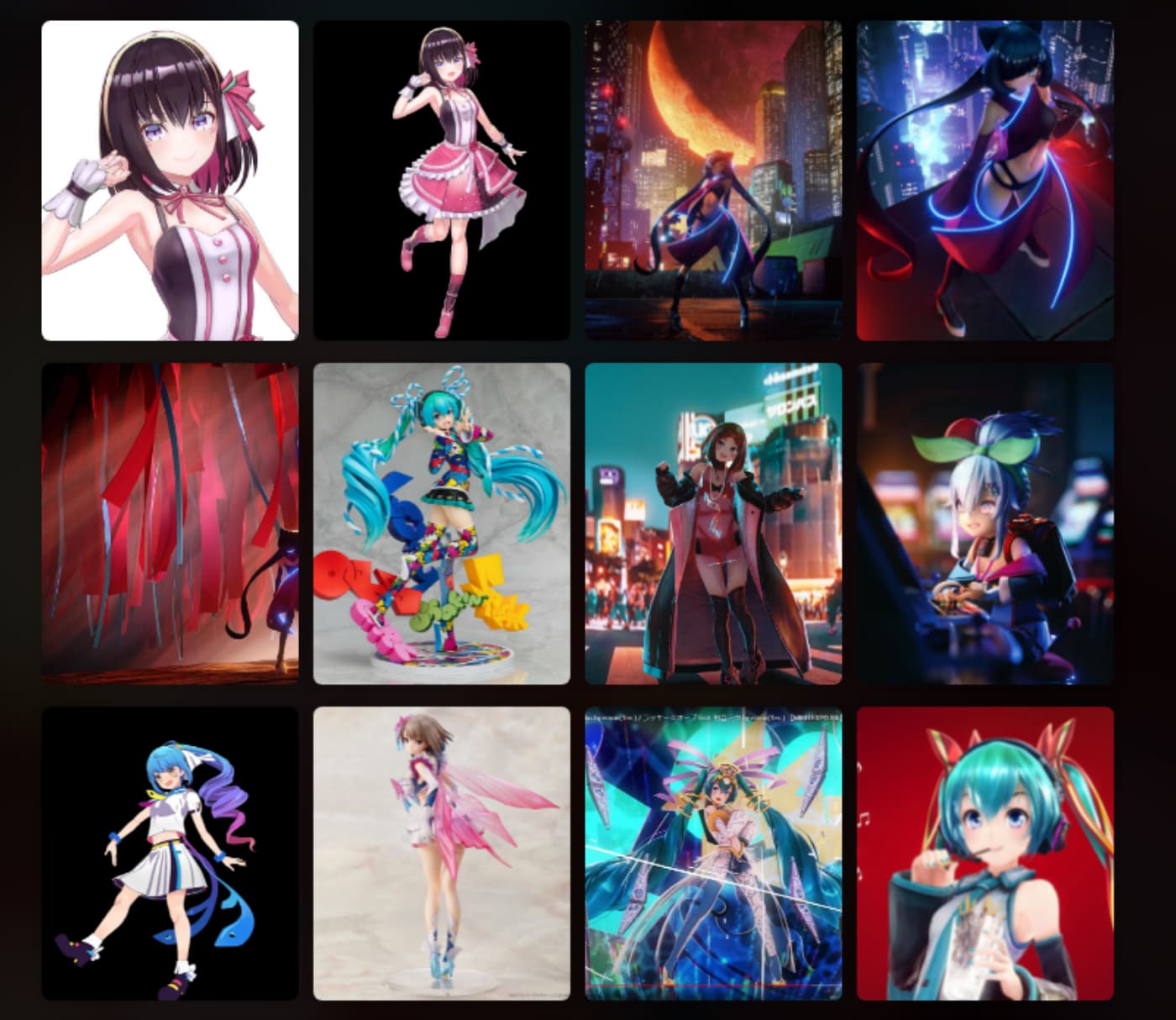
I've tried various things to show in activities, but when I think of it as a portfolio, I still want to control what is displayed by myself, mainly for Instagram photos Now only items tagged with #potofu are displayed. *Note: [Update] The integration of activities with X (Twitter) and Instagram is no longer available.

Carefully selected activities
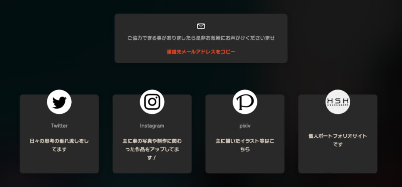
In addition, I like things that are simple and clean, so the icons in the linked list are unified in black and white. As for custom colors, etc., I saved my changes and looked at the preview screen one by one, and chose the one that worked well.

Linked lists are unified with monochrome icons
It took about 3 hours from the time I started making it to the stage of publishing. As a result, it was easy to understand the direction of the work at a glance, and I thought that it would be possible to create an effective portfolio site instead of being easy to start! (Kasoku Sato)
